The Matching-Set Myth: Building an Outfit Without Exact Matches
Build an outfit without exact matches by using contrast and repetition to make separate colours, textures and accessories feel considered, not accidental.
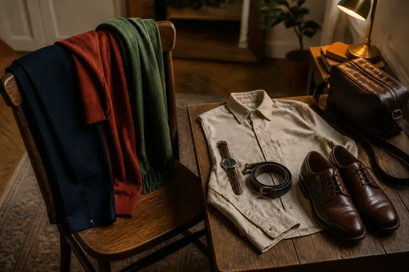
You have navy trousers, a rust jumper and a green scarf on the chair, and none of them quite matches the others. Building an outfit without exact matches is less a hunt for a missing colour and more a matter of deciding what should relate: the colours, their contrast, or the details.
Exact coordination can look polished, but it is only one route to coherence. A set of colours that are nearly, but not quite, alike can seem accidental; distinct colours with a clear relationship often look more deliberate. Try treating contrast and repetition as separate tools, then use each day of a week to practise one small choice.
Start the week by separating matching from cohesion
Matching means two things share a colour, material or visual detail. Cohesion means the parts feel as if they belong in the same outfit. A tan belt and tan shoes match; a tan belt with dark brown shoes may still feel coherent if the outfit already includes warm, earthy colours.
On the first morning, choose one reliable base such as charcoal trousers and a cream shirt. Add a third item that clearly differs, perhaps a burgundy cardigan. Do not add another colour just because the first combination looks too simple. Instead, ask whether the contrast feels intentional and whether the proportions of light and dark are comfortable to look at.
Keep a note of the combination, or take a quick mirror photograph if that is more useful. Record what the colours do together, not whether every item matches. The point is to notice which pairings feel calm, lively or too busy for your taste.
Use contrast on the second day
Contrast comes from difference: light against dark, smooth against nubby, muted against vivid, or a soft shape beside a crisp one. It gives an outfit definition without requiring a matching accessory. A pale blue shirt under a dark brown jacket, for instance, has a clear colour contrast; a matte cotton shirt beside a slightly lustrous skirt adds a material contrast.
On the second day, take one outfit from the first day and change just one feature. If the cardigan was burgundy, try a pale grey one. If the outfit was all matte, add a leather belt or polished metal jewellery. Changing one element at a time makes it easier to see whether the contrast is doing useful work or merely attracting attention.
Imagine you start with an olive overshirt, cream T-shirt and dark denim. You swap a matching olive cap for a faded red cap, leaving everything else as it is. The expected visible result is a sharper colour accent, while the cream and denim keep the outfit from reading as a collection of unrelated brights. If the cap becomes the only thing you see, choose a less vivid shade or leave it out.
Repeat a detail on the third day
Repetition creates a quiet link between pieces without making them identical. A colour can recur in a smaller amount, or a shape, finish or texture can appear twice. The recurrence may be as modest as a brown watch strap echoing the brown in a checked overshirt.
Choose one detail to repeat today. If your shirt has a fine blue stripe, pick a blue bag or a small blue stone in a ring. If the outfit has several warm colours, repeat a warm metal finish in your jewellery and belt buckle. Keep the second appearance smaller than the first; two equally prominent accents may compete rather than connect.
Repetition is not a demand to duplicate accessories. It works best as a hint. A charcoal coat and black boots can sit together without identical shades if another dark detail, such as a bag handle, brings the two parts into a loose conversation.
Compare the two methods on the fourth day
For the fourth day, use the same base outfit twice in your mind, or on separate outings if your schedule allows. In one version, repeat a colour: a cream jumper with cream trainers. In the other, use contrast: the same jumper with dark green shoes. Both can work, but they create different impressions. Repetition tends to make the outfit feel quieter; contrast gives the footwear more presence.
Consider the setting as well as your preference. A contrast may feel lively for a casual lunch and distracting in a room where you would rather blend in. A repeated detail can look restrained, though too many close shades may make a set seem as if it almost matched. If two pieces are visibly different, let that difference look chosen instead of trying to disguise it.
What is not worth the effort: replacing a useful bag or belt because its shade is not an exact match for your shoes. If the items share a sensible relationship with the rest of the outfit, the difference is usually more interesting than a forced pair.
Use the fifth day to edit accessories
Accessories are often where the matching-set myth becomes most expensive. Shoes, bags, belts and jewellery do not need to arrive as a coordinated family. They do need to suit the outfit’s level of formality and avoid pulling in several unrelated directions at once.
Lay out the outfit, then add accessories one at a time. Check the shoes against the hem and overall formality, the bag against the outfit’s colour balance, and jewellery against the neckline and any other visible metal. A brown leather bag with black shoes is not automatically a problem. If the clothes contain both colours, the combination can look considered; if not, a repeated warm brown detail elsewhere may help.
For a practical limit, keep one accessory prominent and let the rest support it. A patterned scarf can carry the visual interest while plain shoes and a simple bag leave it room. This is not a rule against expressive dressing; it is a way to choose where the eye lands.
Adjust the plan when the outfit feels unsettled
Use the sixth morning to diagnose rather than start over. If the outfit looks flat, add contrast through a lighter layer, a deeper shoe or a more textured fabric. If it feels scattered, remove one strong colour or repeat a small detail already present. If the colours are close but not convincing, change one of them rather than searching for an exact match.
On the seventh day, wear the combination that felt most like you, not the one that followed the neatest theory. Notice what you would alter next time: perhaps a softer contrast, fewer accessories or one recurring colour. A useful wardrobe practice should make decisions easier, not turn getting dressed into a colour examination.
Which outfit choices need an exact match?
Do shoes and bags have to match?
No. They can differ in colour and material if their relationship to the clothes feels deliberate. Repeating a colour elsewhere, or keeping one accessory visually quiet, can tie them together.
Can different shades of the same colour work together?
Yes, especially when the difference is clear enough to read as variation rather than a failed match. For example, pale blue and navy give a clean tonal contrast, while two almost identical blues can look less settled.
How many colours can an outfit include?
There is no useful universal count, because pattern, brightness and the amount of each colour matter as much as the number. If an outfit feels busy, remove or soften one accent before replacing every item with a neutral.
What if an outfit still looks wrong?
Check its overall balance: where the darkest and brightest areas sit, whether one accessory dominates, and whether the formality of the pieces agrees. Change one item at a time so you can tell what improved the result.
Build an outfit without exact matches by choosing either a visible contrast or a small repeated detail, then give the rest of the clothes room to be themselves. When a combination feels close but not quite right, make the difference clearer or simplify the supporting pieces. Exact sameness is an option, not a dress code.